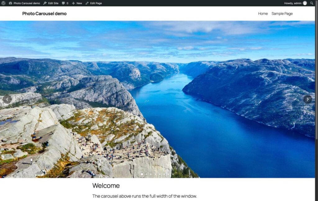
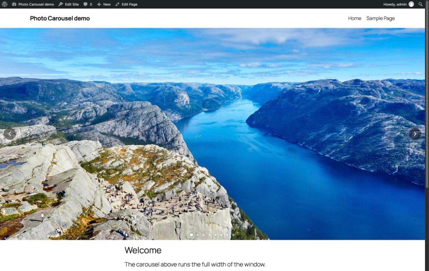
So Long Slider Revolution, Hello JP Photo Carousel!
The photos across the top of my homepage have been running on Slider Revolution since 2023. It’s a paid plugin, and the only thing I ever used it for was that one carousel. Updates always seemed to show up late from the theme publisher, it didn’t handle phones the way I wanted, and the settings were extremely convoluted, screen after screen of options I never touched. With a bunch of my other tools getting built with Claude Code lately, now seemed like as good a time as any to swap it out for something that just does the one job.
So I had Claude Code write me a small plugin that does the carousel and nothing else. I pick the photos, it fills the width of the page, and I choose how long each photo stays up and how it changes to the next one. Nice and easy! It’s called JP Photo Carousel, and it’s running on the homepage now, so if you’ve been to the front page lately you’ve already seen it.
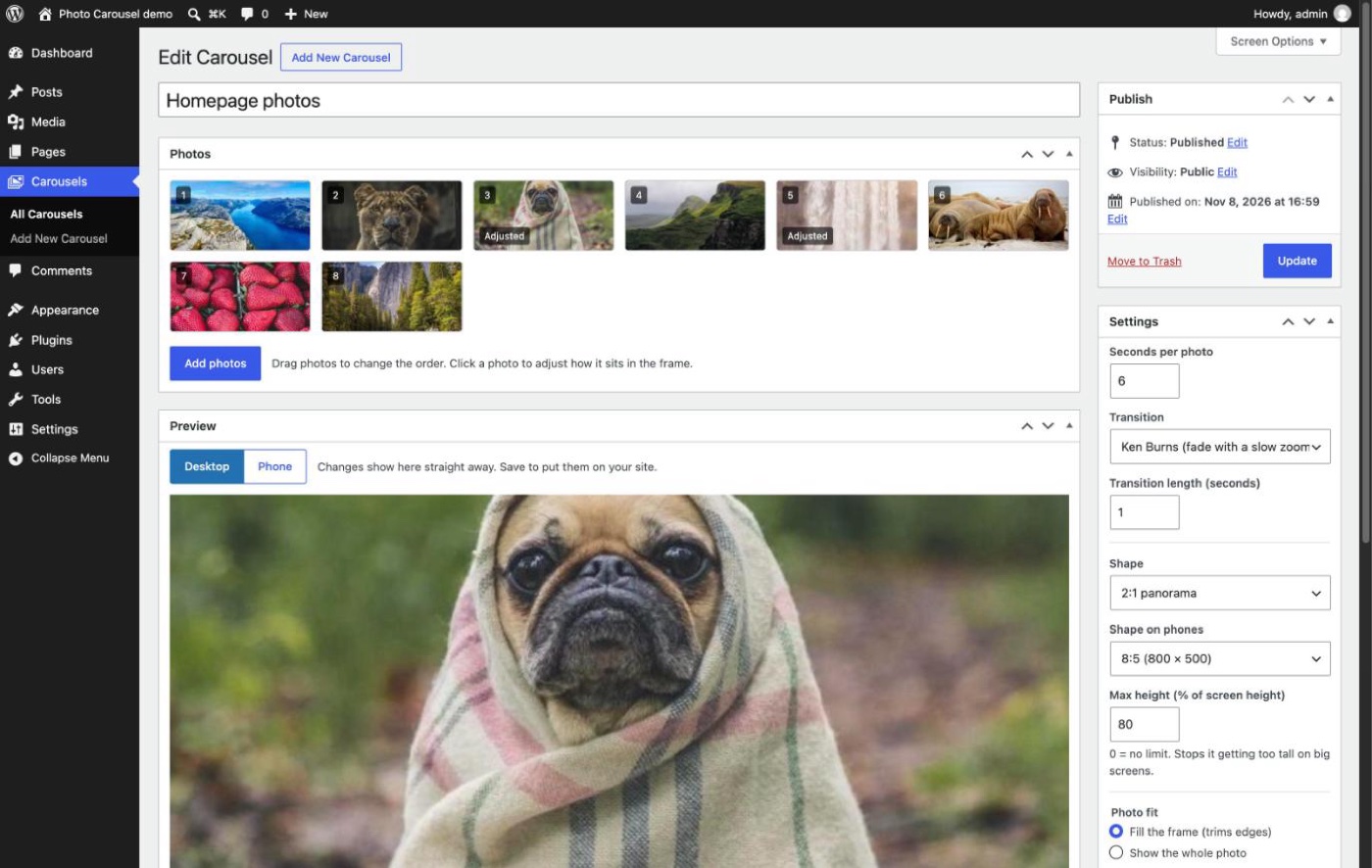
Picking the photos
Carousels get their own menu in the WordPress admin. Add photos opens the normal Media Library, so I can grab what’s already on the site or upload new ones right there. The thumbnails are cut to the shape of the carousel, so I can see straight away how each photo is going to be cropped, and I just drag them around to change the order. No more digging through tabs to find where the slides live.
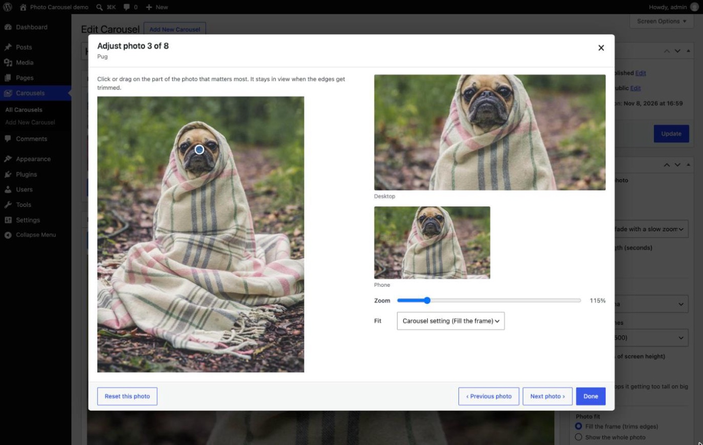
Keeping the good bit in frame
When a photo doesn’t match the shape of the carousel the edges get trimmed, and of course sometimes the trimmed bit is the important bit. Clicking a photo opens an Adjust photo window where I click on the part that matters (the pug’s face here, priorities!) and that part stays in view however the photo gets cropped. It shows the desktop and phone frames side by side, and there’s a zoom slider and a choice between filling the frame or showing the whole photo with bars at the sides.
Only the settings I actually wanted
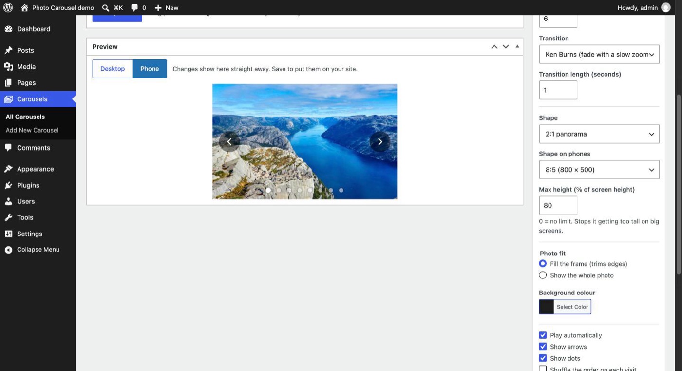
The settings are the ones I actually wanted, and that’s about it. I can set the seconds per photo, how long the transition takes, and which transition it uses: fade, slide, Ken Burns (a fade with a slow zoom), zoom in and fade, or a straight cut. There’s the shape of the frame, with a different shape for phones if I want one, and a max height so it doesn’t take over a big monitor. The arrows and dots fade in when the mouse is over the carousel and stay out of the way the rest of the time, and on a phone they show for a few seconds after a tap.
The Preview box plays the carousel with whatever’s in the settings before I save anything, and the Phone button shows it at phone size, so there’s no saving and refreshing the homepage to see what a change looks like.
Putting it on a page
My homepage is built with WPBakery, so the carousel shows up there as a Photo Carousel element and I just pick which carousel it should show. In the block editor there’s a Photo Carousel block for dropping one into a blog post, and a shortcode for anywhere else. On the homepage one carousel now does the job of the old two. It runs edge to edge across the window on a desktop and works on phones as well, so the separate mobile-only row could finally go. Win Win!


How it’s built
I built it with Claude Code. It’s a normal WordPress plugin written in PHP, and the carousel itself is plain JavaScript and CSS with no libraries. Only the first photo loads with the page, the rest load just before they’re shown and at the size they’ll actually be drawn, and the carousel takes a break while the tab is in the background or it’s scrolled off screen. So it shouldn’t slow the homepage down any.
For testing, Claude ran WordPress right on my Mac with WordPress Playground, which is pretty handy, it runs a whole WordPress site in Node with no web server or database to set up. It filled the site with some stock photos and clicked through the admin in Chrome, and that turned up a bug early on where the Photos box kept vanishing because it had the same ID as the list of photos inside it. The one part it couldn’t try was the WPBakery element, as WPBakery is a paid plugin, but that worked first time on the real site, and I’ll take that!
The whole thing took an afternoon, from planning it to having it live on the homepage, and Slider Revolution is now switched off. One less paid plugin to keep track of, and one less thing to wait on updates for!


No Comments